What we did
The brief:
The new range design should establish Fortnum & Mason as the leading authority in the luxury market for tea and act as the catalyst for a truly exceptional shopping experience, building levels of purchase among existing loyals and attracting new customers.
The solution:
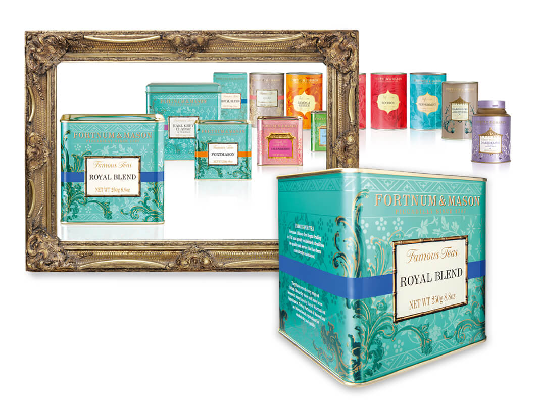
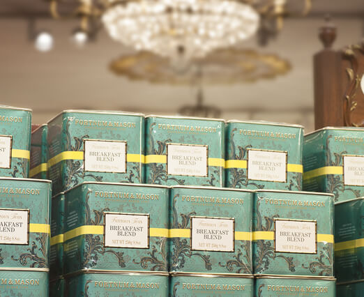
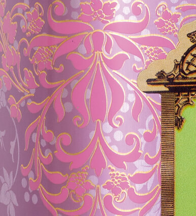
The new design features a range of decorative elements which conjure up the ambience of the luxury tea experience for which Fortnum's is famous and which are inspired by the interior design details of the Diamond Jubilee Tea Salon. Each of the seven tea ranges and the products contained within are clearly colour coded (via overall background design - style and colour - for range identification, and graphic 'ribbon' - for variant communication) with the application of highly legible fonts for improved navigation.
The additional colour coding applied to the lids of all tins and caddies, and unique complementary decorative elements for each range helps reinforce differentiation. The combination of improved variant differentiation via effective colour coding, enhanced product descriptor legibility, the naming of each range and the 'bamboo' panel border and 'flowing' decorative design on the Famous Teas increase the ability of the range to communicate with, and appeal to, Far Eastern markets.
The Eau de Nil colour was applied to the Famous Teas hero range, with the colour also being applied to the lids of the tins to optimise appeal to the global shopper.


